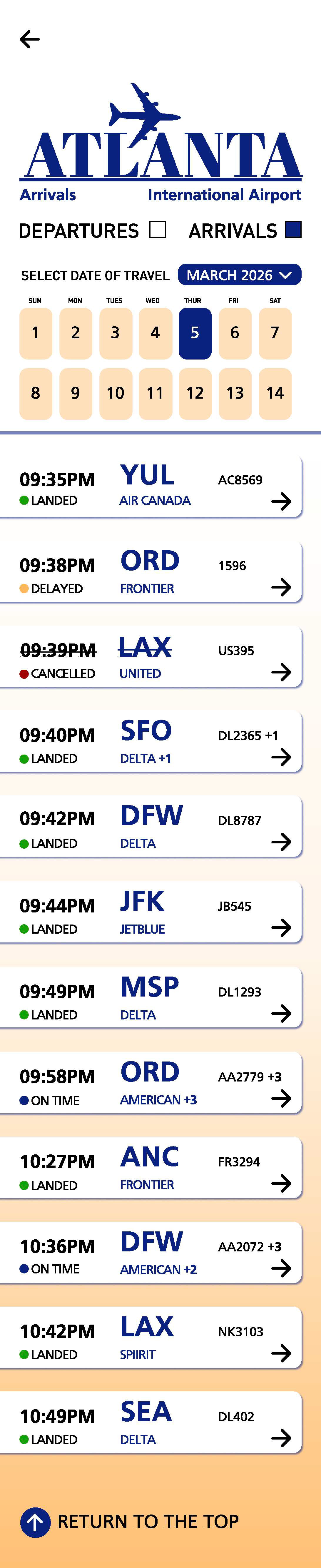
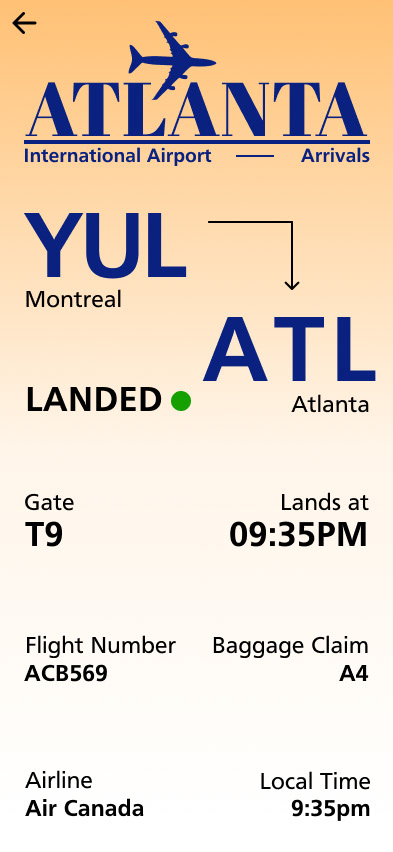
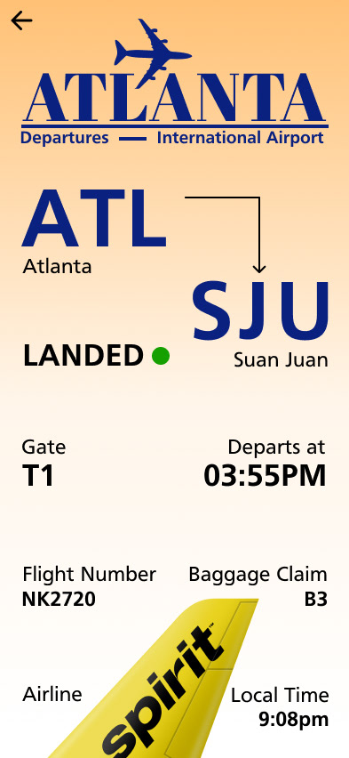
Objective: "Develop a FIDS (flight information display system) to be viewed on the phone to communicate flight information to passengers in real-time. Even though more utilitarian and complex than the recent instructional design assignment, possible experimentation exists and is encouraged. Always seek a better way. Building on recently gained typographic skills, students will now be introduced to other viewing/reading factors."
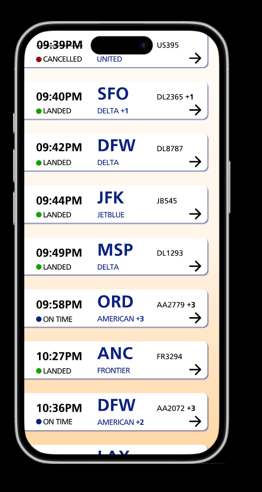
Research
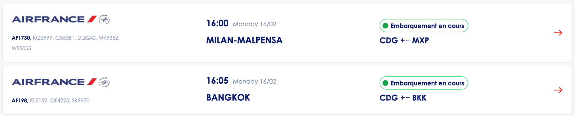
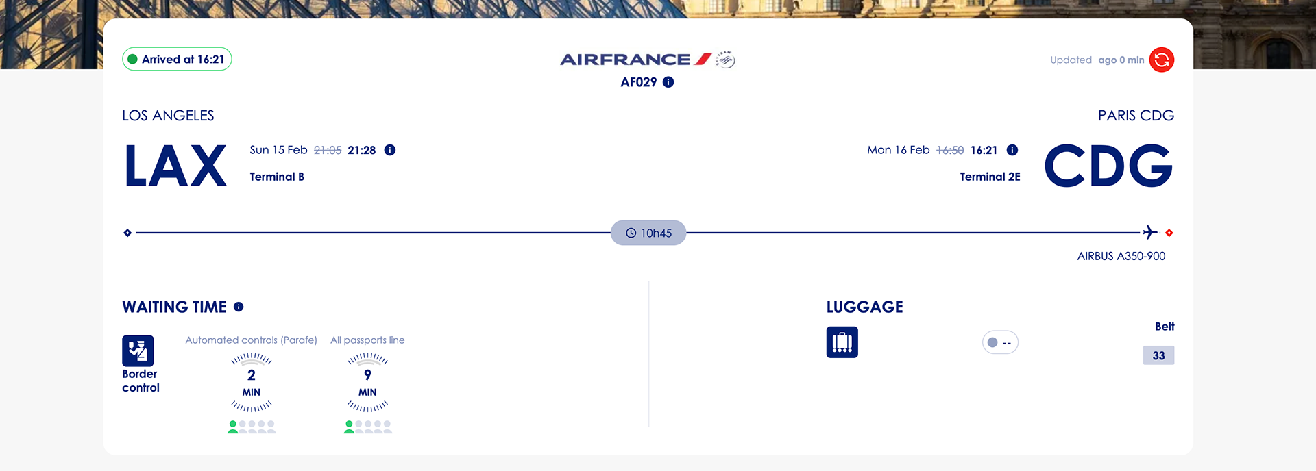
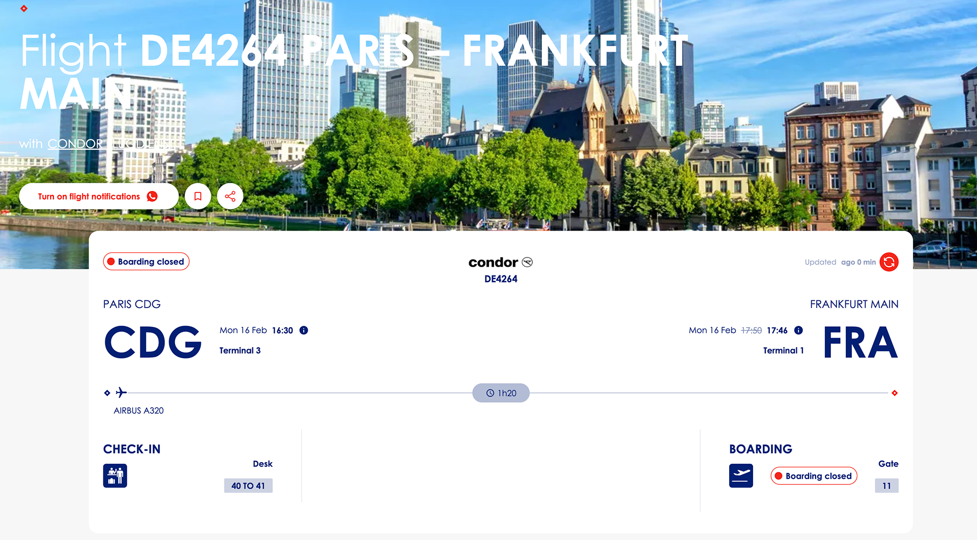
I began this project by researching many different airports near and far, both domestic and international, and studying the various tools and techniques they used to design their app interfaces. Throughout my research, I began to develop a sense of what I did and did not want to include in my app design. And during our classes, I participated in many different workshops to view app deisgn from each perspective that is looking at the app.
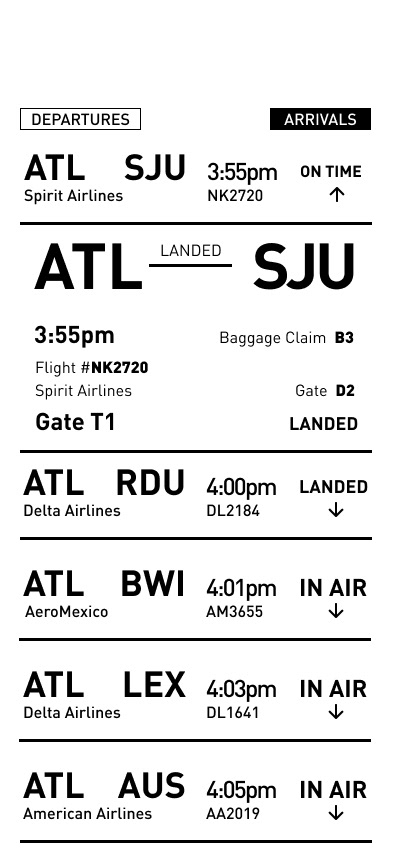
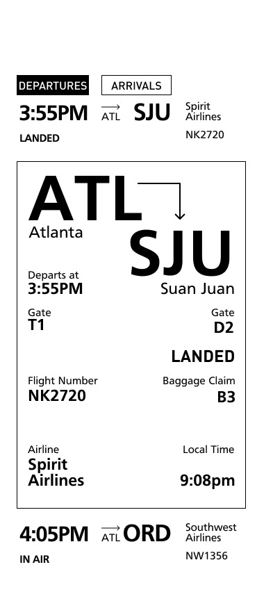
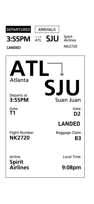
Interface Home Screen
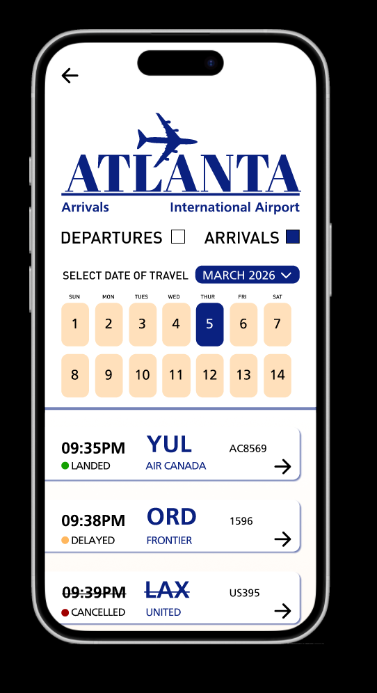
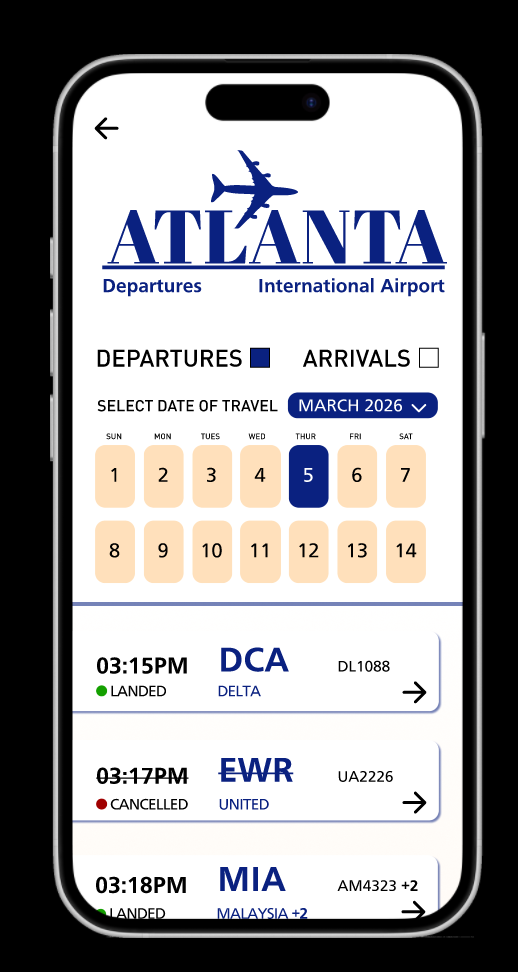
Continued experimenting with how the airline home screen would look with different fonts and styles.
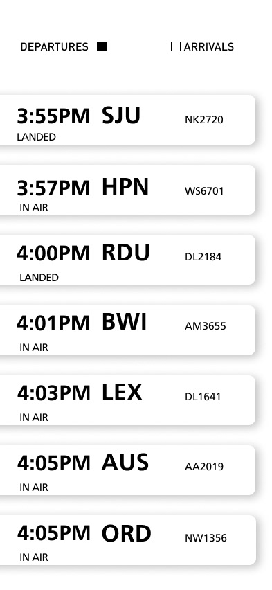
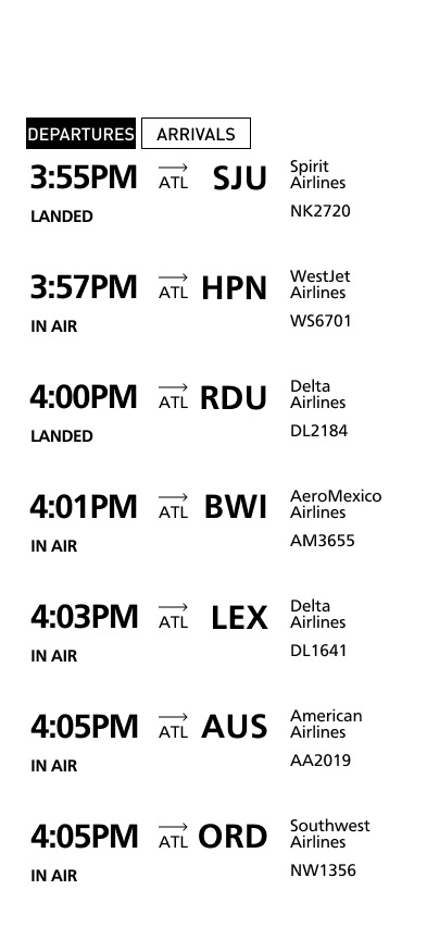
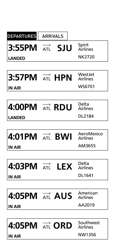
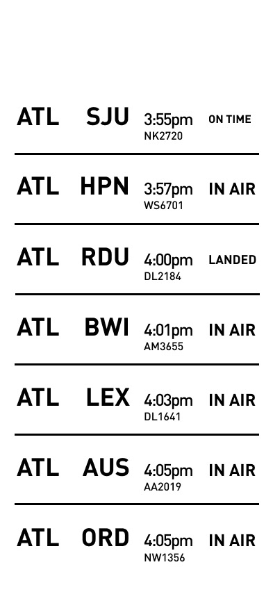


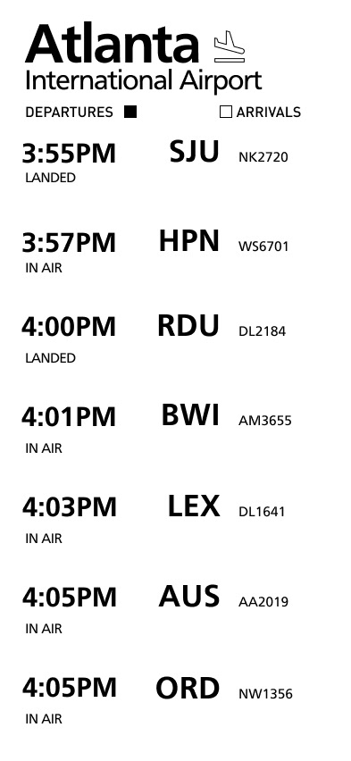

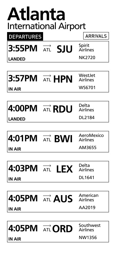
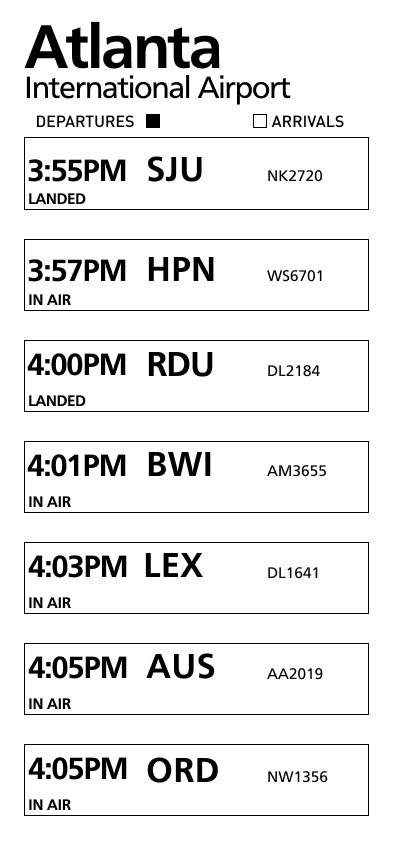
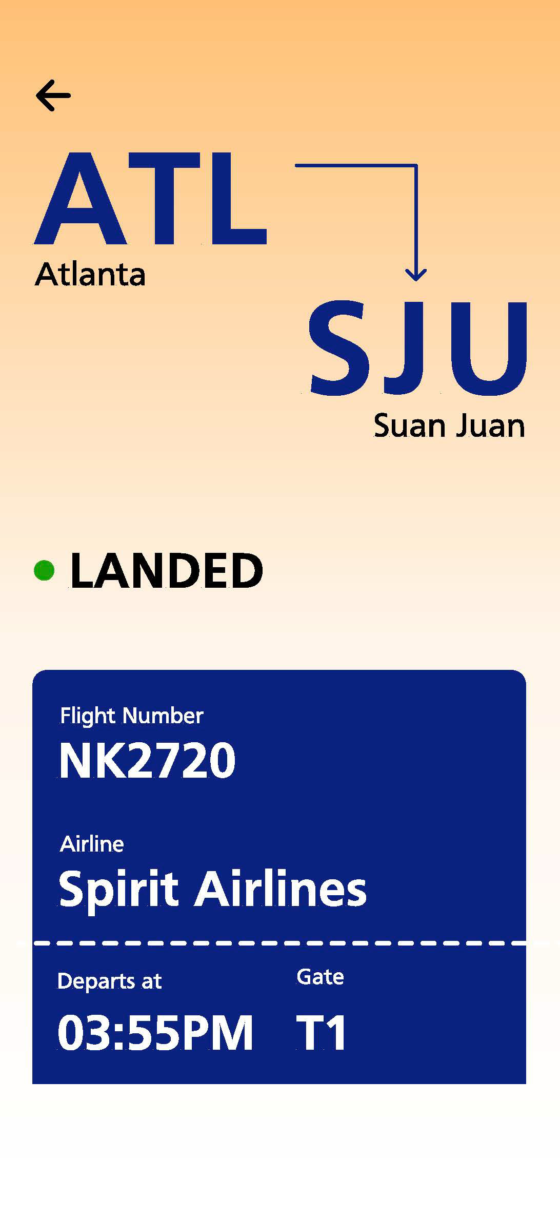
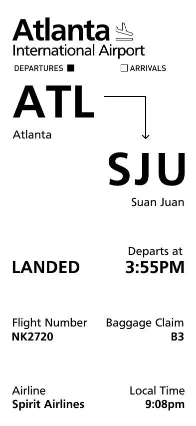
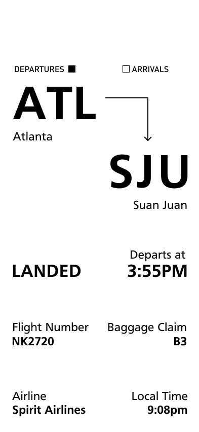
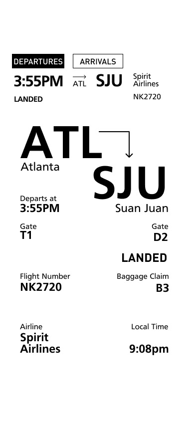
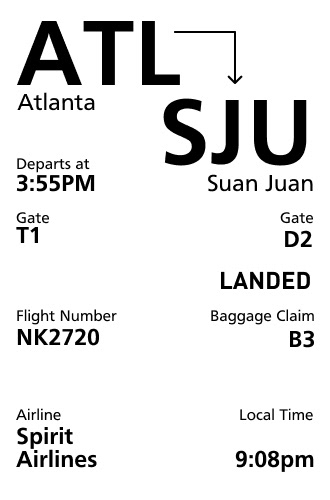
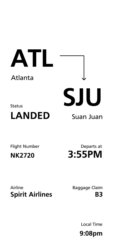
Detailed Airline Screen
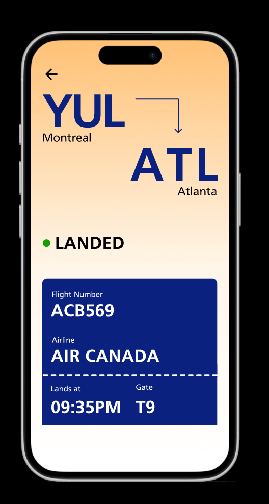
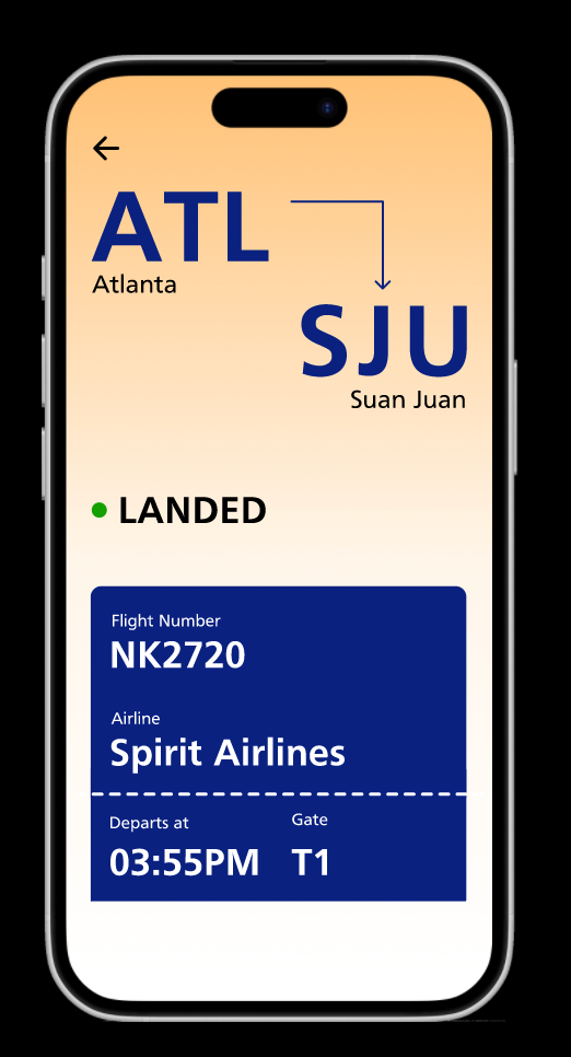
Continued experimenting with how the airline detailed screen would look with different fonts and styles.


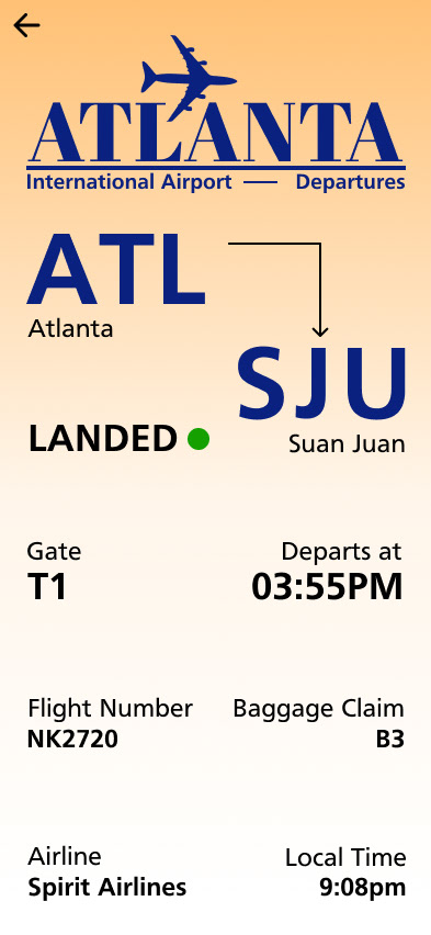
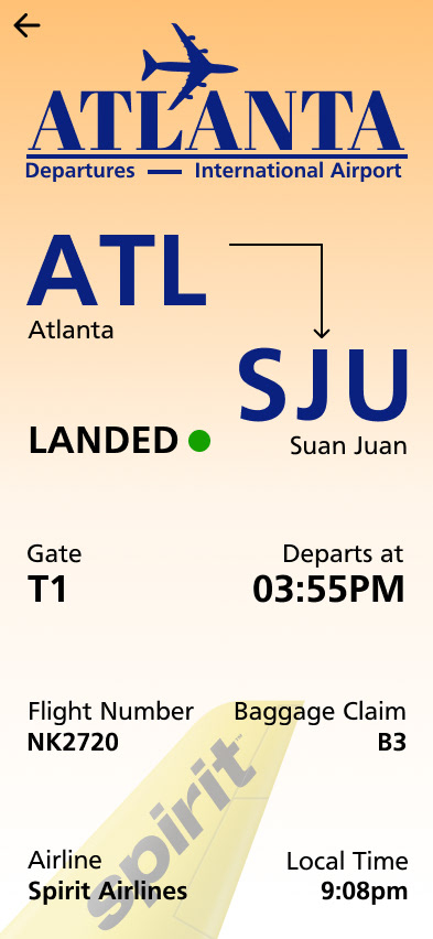
Integration of Color into App Interface
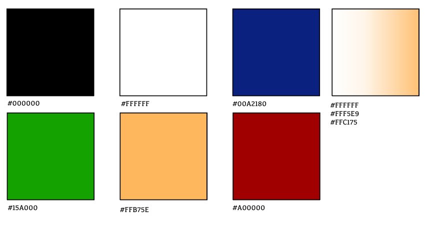
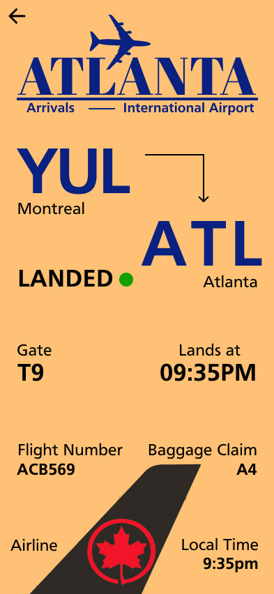
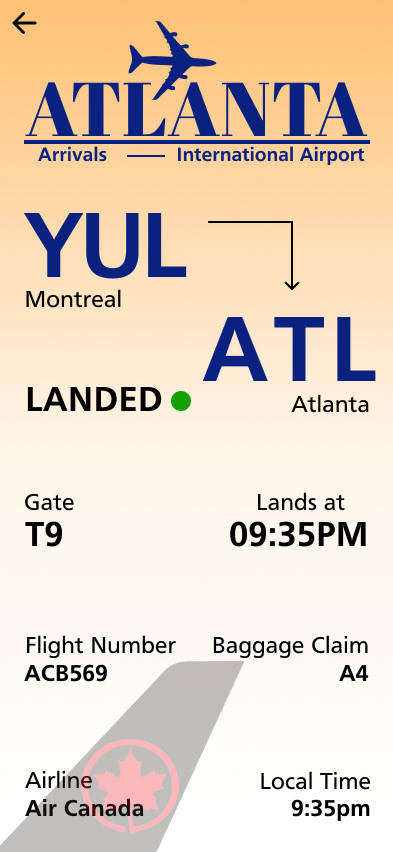
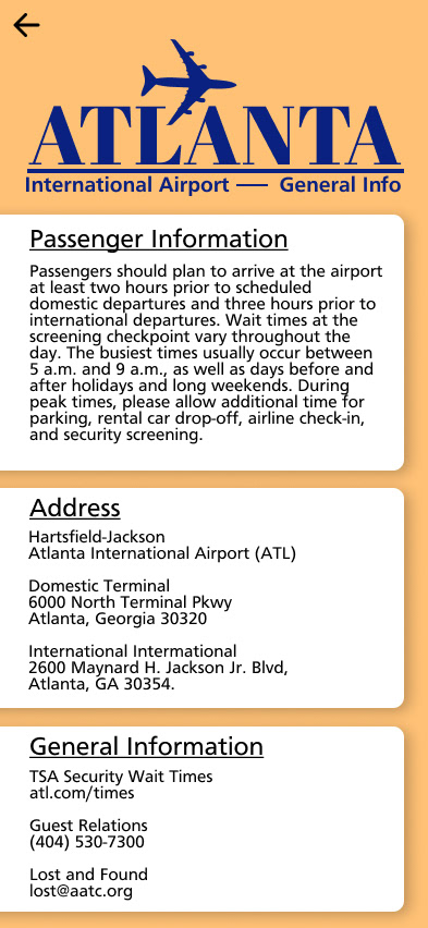
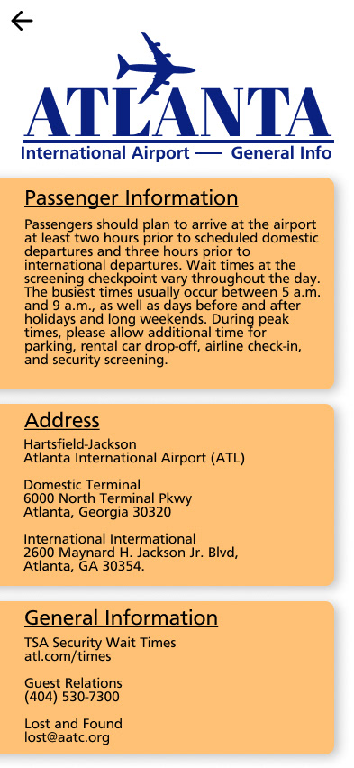
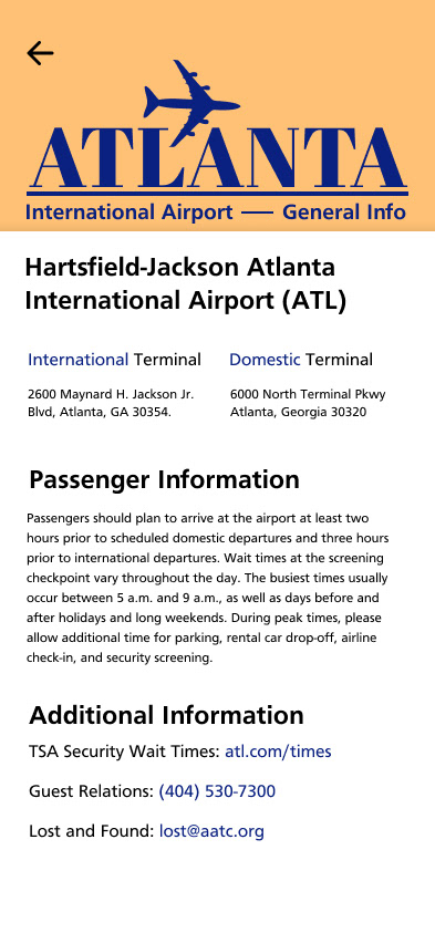
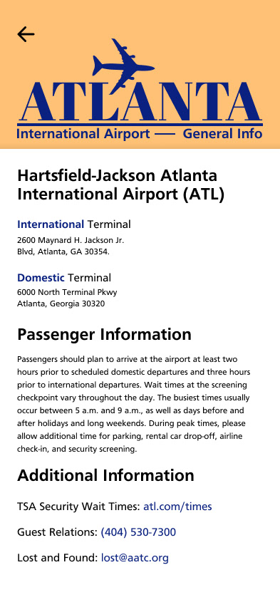
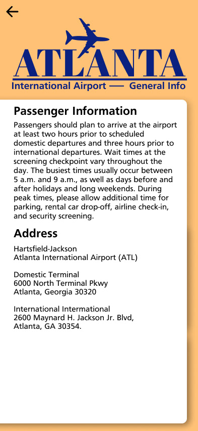
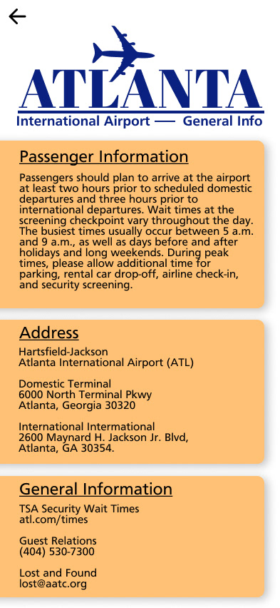
Throughout the design process, I focused mainly on the process of iterating in black and white; then I slowly began adding color. The process of adding color was an intentional one, and I chose my colors wisely. I chose the color orange to showcase the character that Atlanta has, with the oranges that the city is known for. The color blue complemented the orange nicely.

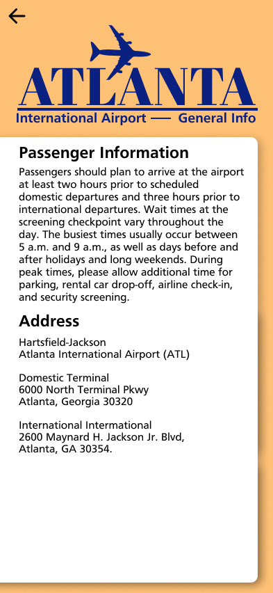


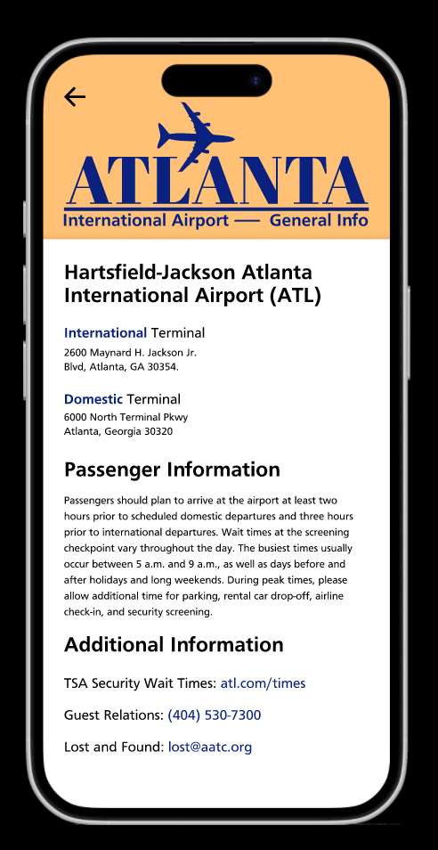
Airport General Information

Final Project